Led cross-functional teams to successfully deliver projects on time, improving overall operational efficiency.
Supervised and mentored a team of designers, ensuring high-quality deliverables and professional growth.
Provided creative direction and constructive feedback to enhance the quality of design deliverables.
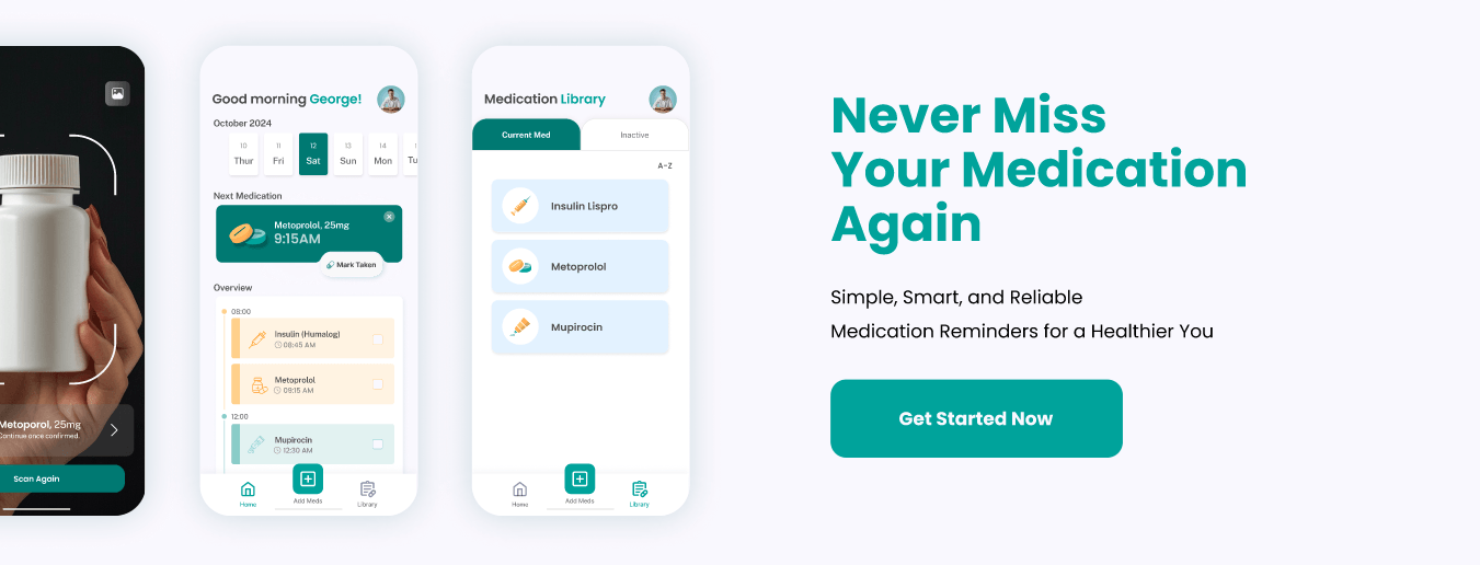
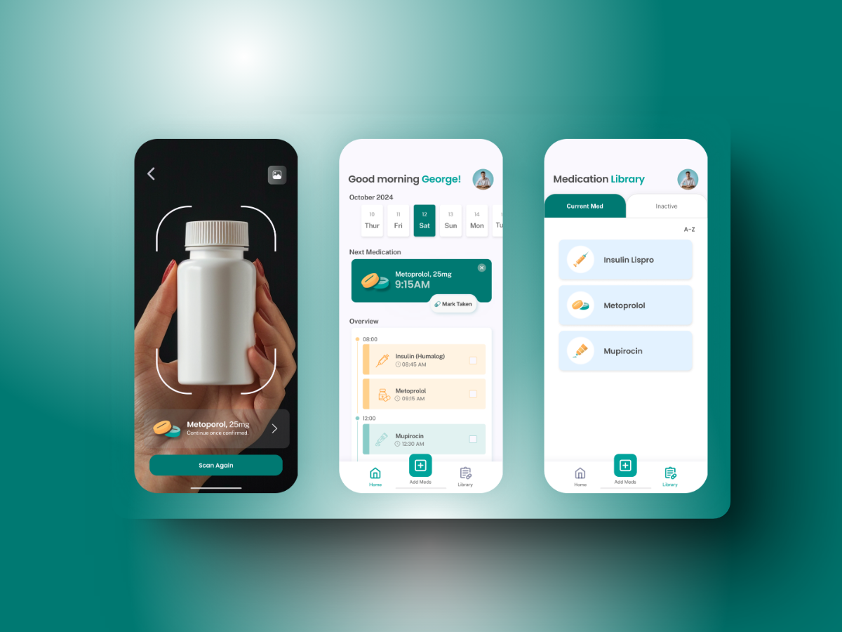
Remedify is a smart mobile app that transforms medication management. Powered by AI, it offers personalized reminders, comprehensive drug details, and seamless scheduling—all within a user-friendly and accessible interface. Its core values are to improve medication adherence, be accessible and easy to use for everyone, provide ongoing guidance and support, and empower users with full control of their medication.
Demo Video
Hi-Fidelity Prototype
Problem
Low Adherence Rate:
Patients with chronic illnesses take only ~50% of prescribed medications.
Misunderstanding Instructions:
Over 60% of patients misunderstand medication directions after doctor visits.
Forgetfulness:
A major cause of non-adherence, affecting 49.6% of patients.
Solution
Simplify Medication Regimens:
Provides clear, organized schedules to prevent confusion.
Explain Key Information:
Displays essential details about each medication, including what the drug is and why is it prescribed.
Smart Reminders:
Sends timely alerts to help users take medications on time.
Features
One-Tap Medication Logging
Record each dose with a single tap and effortlessly track your medications through a simple, intuitive interface.
AI-Powered Label Scanning
Quickly scan medication labels to auto-set reminders, reducing steps and simplifying the process.
Accessible Medication Library
Access all your medications in a clear, organized library with reliable, easy-to-understand information to empower users.
Dark Mode Support
Features a dark mode to minimize eye strain and improve accessibility, especially for users with visual sensitivities.
User Research
Tracking Medication: Many users struggle to remember if or when they’ve taken their medication, emphasizing the need for clear tracking and reminders.
Understanding Medications: Limited knowledge about medications can lead to poor adherence. Providing education helps reduce concerns and improve proper usage.
Prioritizing Simplicity: Many existing apps are complex and difficult to navigate, making ease of use essential.
User Persona
User personas help identify and address the needs of the target audience, guiding design decisions to keep the app practical, user-friendly, and relevant.
Primary Persona: Elderly Individual;
An older adult with memory challenges who needs to manage multiple daily medications.
Secondary Persona: Caregiver;
A caregiver responsible for overseeing and ensuring a loved one’s medication schedule is followed.
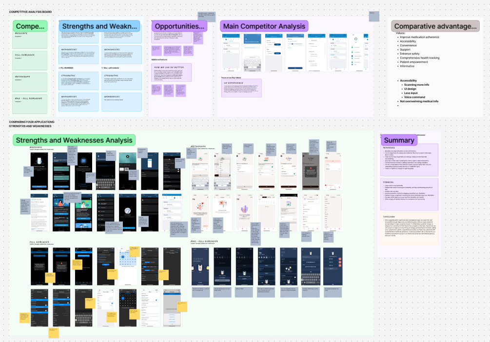
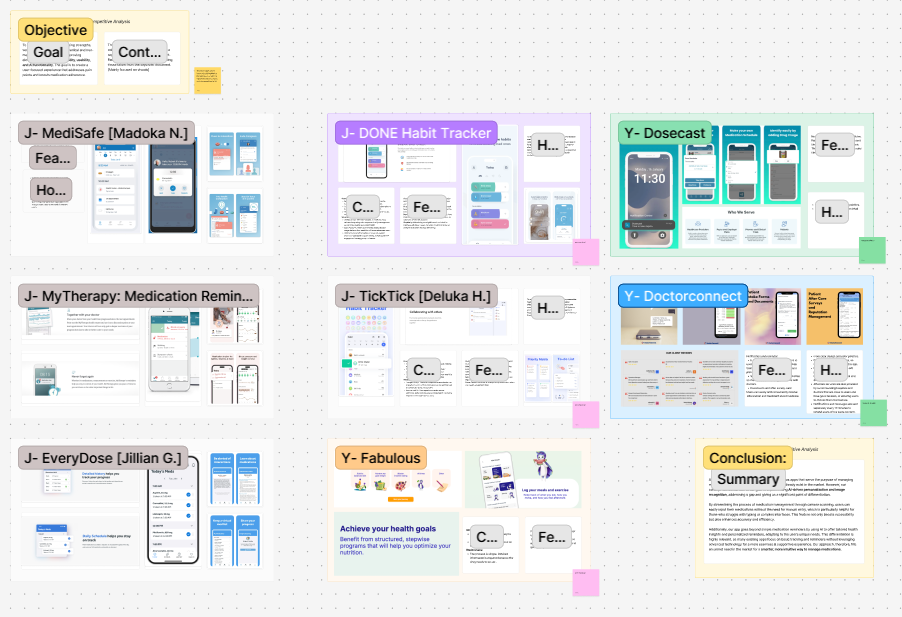
Competitive Analysis
Analyzing the competition was essential for understanding existing options and uncovering areas for improvement. By evaluating current medication management apps, the team recognized their strengths as well as the gaps that needed attention. This insight helped shape Remedify into a more intelligent and user-centered solution.
In-Depth Competitive Analysis
UI Focused Competitive Analysis
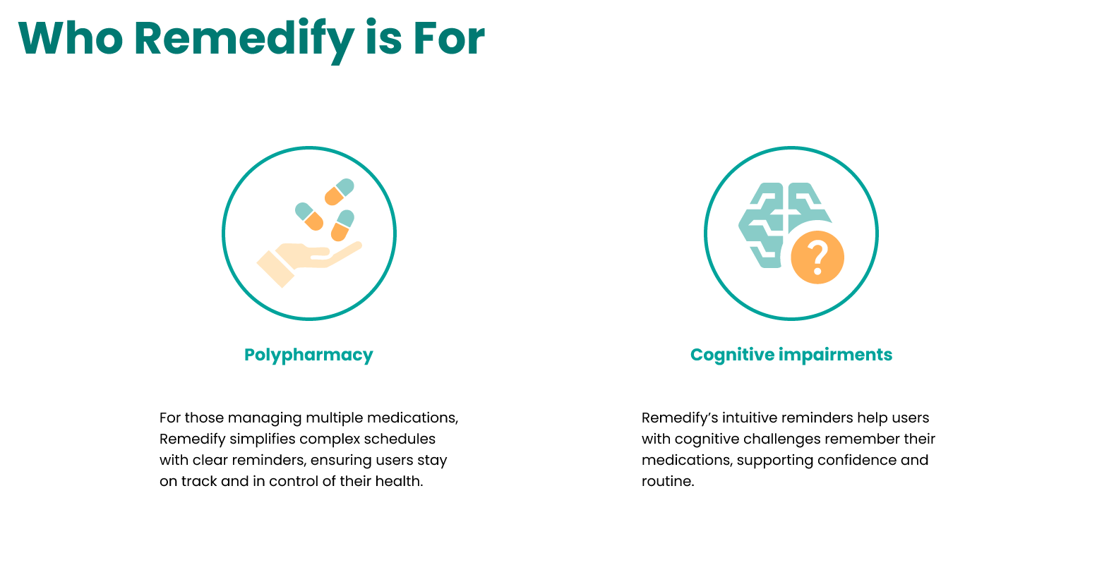
Target Audience
Polypharmacy
Many users struggle to remember if or when they’ve taken their medication, emphasizing the need for clear tracking and reminders.
Cognitive Impairments
Remedify’s user-friendly reminders assist individuals with cognitive challenges in remembering their medications, fostering confidence and helping maintain a routine.
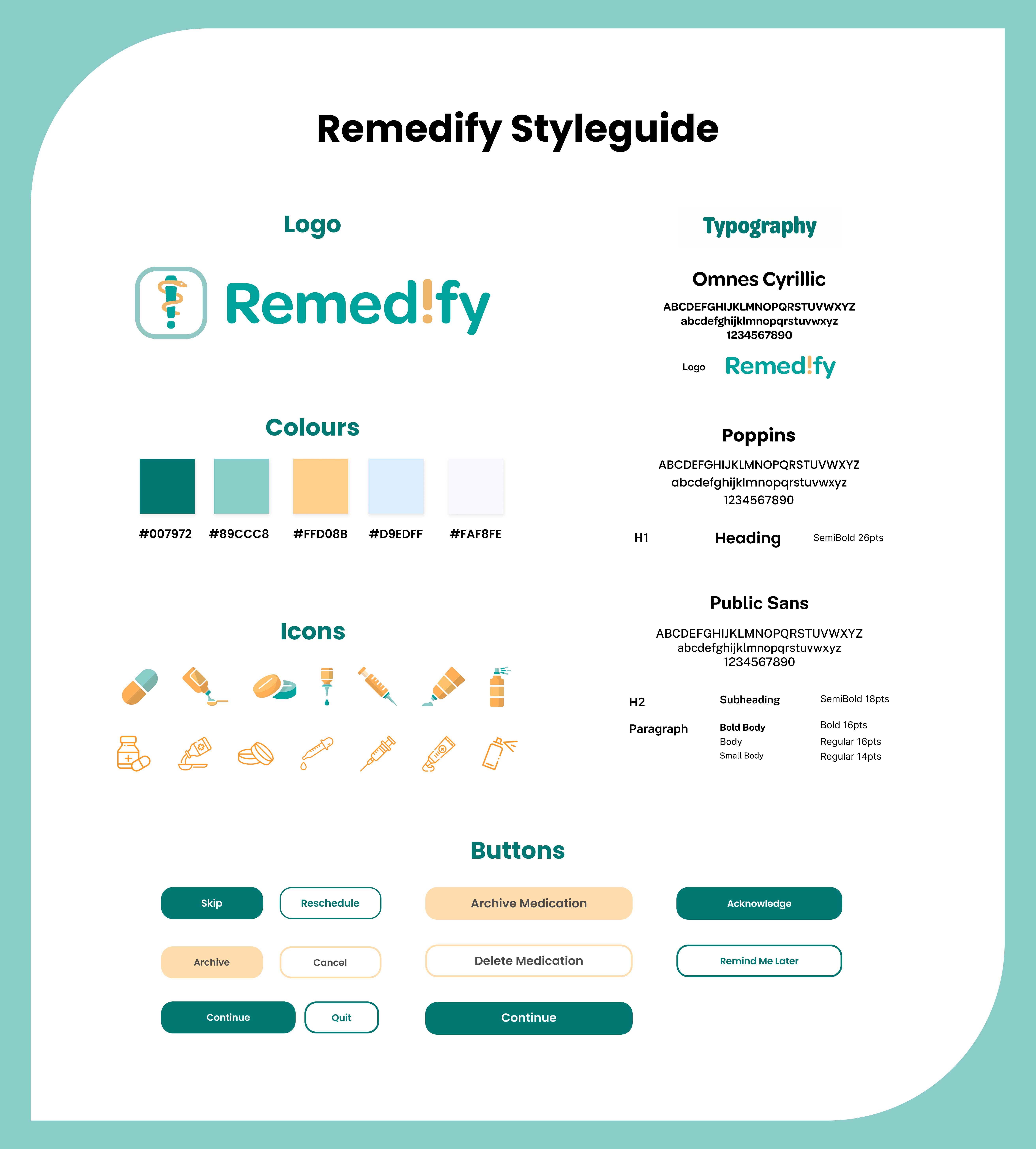
Style Guide
The Remedify app's style guide is designed to reflect its mission of helping users manage their health and medications. It aims to create a calming, warm, inclusive, and accessible experience.
Logo
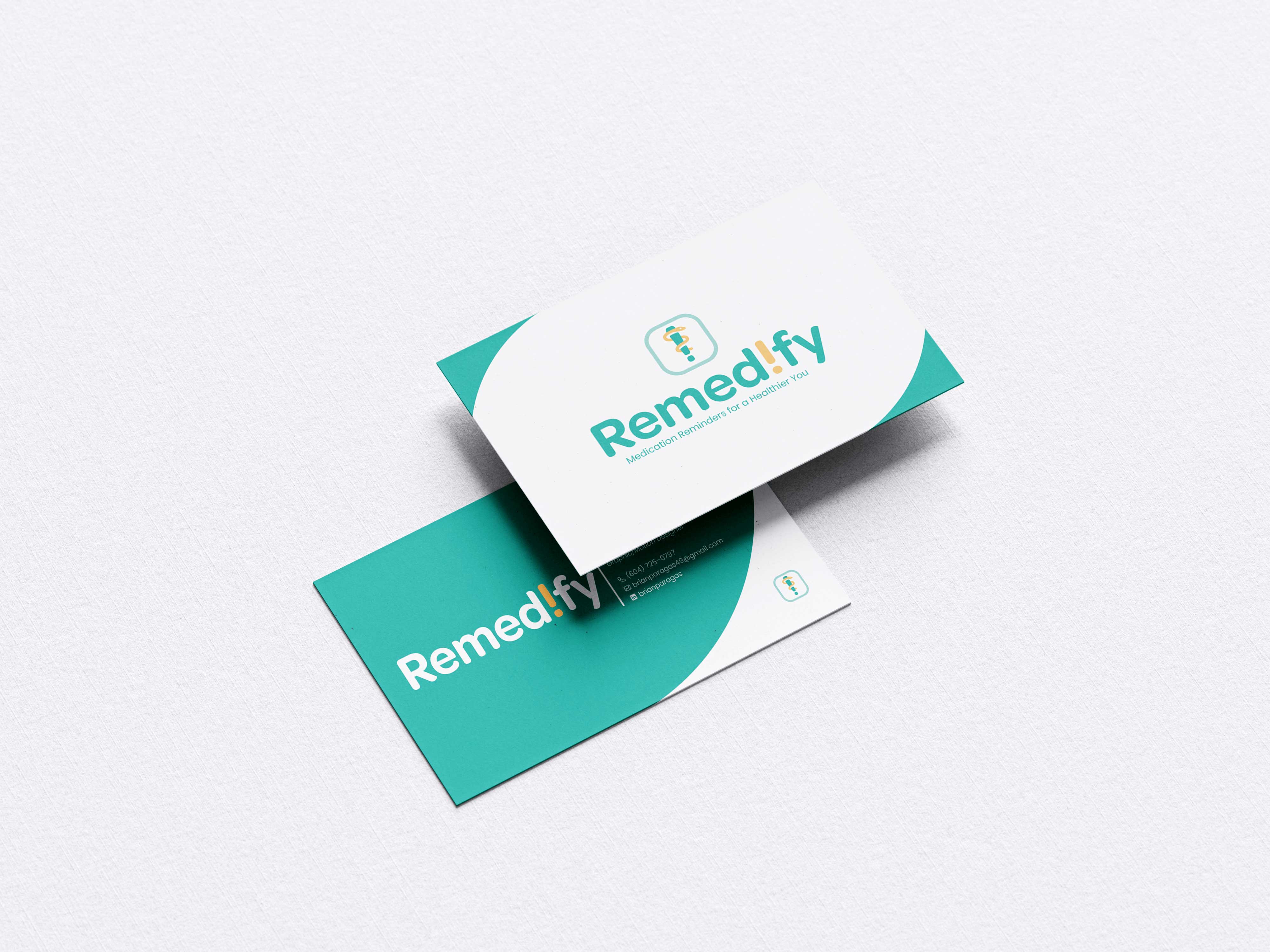
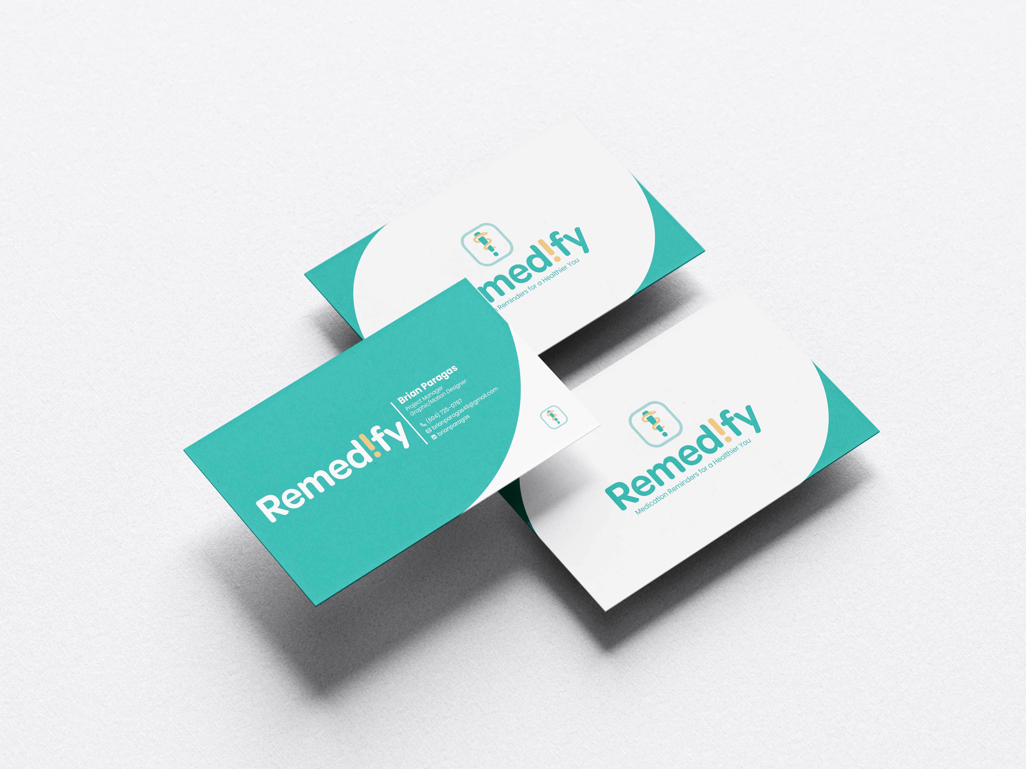
The logo merges symbols representing health and reminders.
The Rod of Asclepius: A recognized medical symbol, emphasizing the app’s focus on healing and wellness.
An Exclamation Mark: Highlights the app’s goal of assisting users in staying on track with their medication.
Colours
Green and Blue: Inspire a sense of calm and reassurance.
Orange: Brings warmth, creating a comforting experience for users, particularly patients managing health conditions.
Silver White: Represents simplicity and cleanliness.
Typography
Omnes Cyrillic: Featured in the logo wordmark for its rounded, approachable style.
Poppins: Used for headings and button text across the app, selected for its friendly and easy-to-read design.
Public Sans: Chosen for the body font to establish a clear visual hierarchy and improve readability.
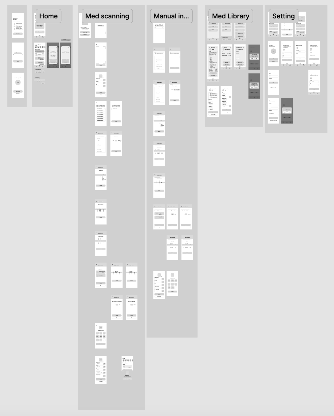
Wireframe
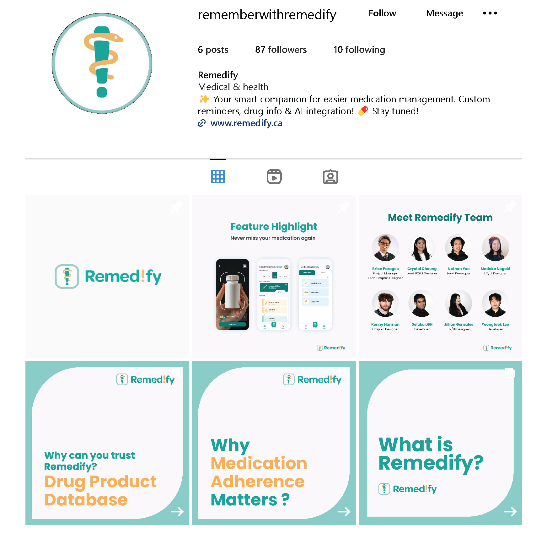
Marketing
Remedify was marketed and promoted on platforms like LinkedIn and Instagram through engaging content and targeted campaigns that highlighted its unique features and benefits for medication management.
Instagram
The Remedify brand maintained consistency across social media platforms, ensuring a unified message and visual identity.
Business Cards
Motion Graphics
The motion graphics video was created to promote Remedify by visually showcasing its features and benefits, capturing users' attention and encouraging them to engage with the app.